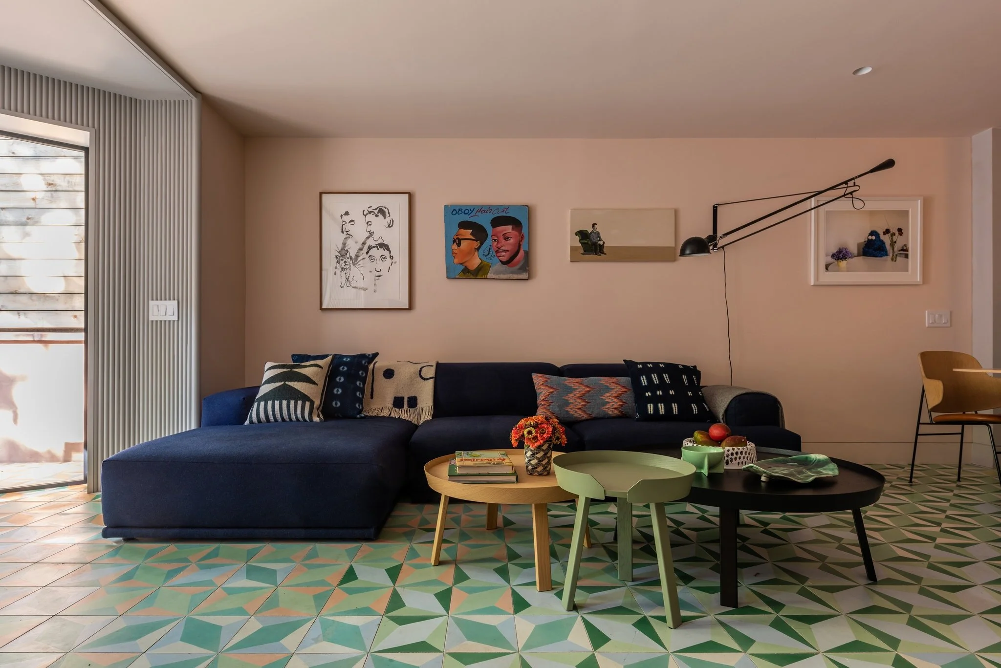
Last night I stumbled upon this beautiful home in the New York Times. The use of color and saturation really stood out to me. The other thing that stood out was a quote from the architect designer Michael Chen “My least favorite design expression is ‘Pop of color’ .” This really struck me, an interior designer who loves color and uses that phrase probably too much. I love using a neutral palette and adding color and pattern to contrast that. I love a pantry or powder room saturated in color and how that creates a little experience. Is the pop of color trend coming to an end?
Windows, moldings, walls, and ceiling are saturated in this coral color. Photo by Alan Tansey for NYT
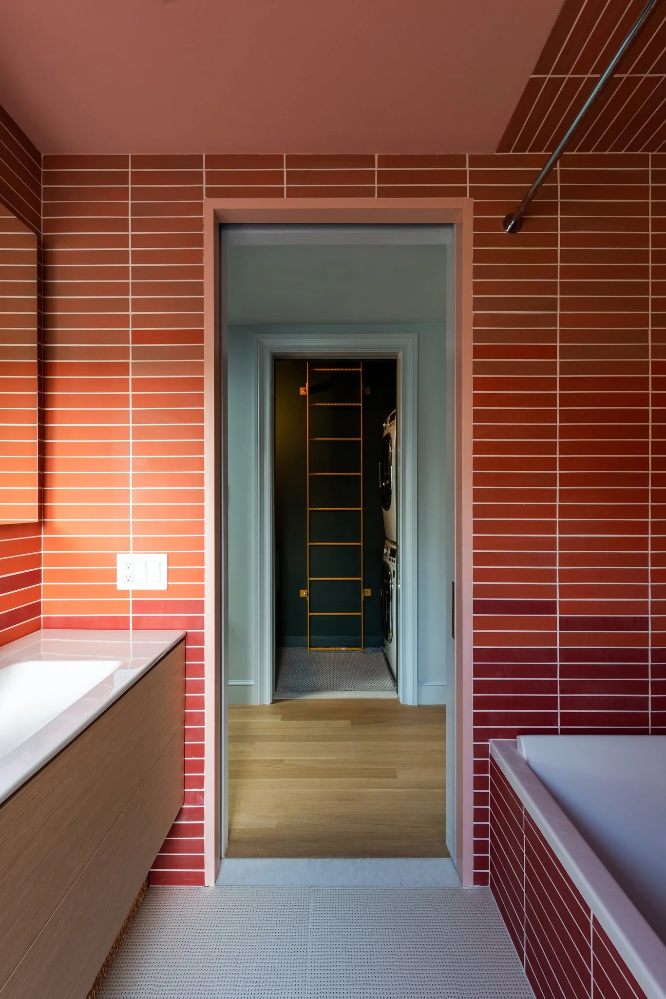
After spending more time looking over the photos, I started to get how Chen was thinking. This home is saturated throughout and all of the colors work together to create a larger picture. Lots of different floors and rooms allow the color to tell a story, yet if you looked at a color chart with all of the colors from the home, they all work together. It’s less about avoiding a ‘pop of color’ and more about using color to enliven your entire home in a well planned way.
This room on a lower floor has light peach walls and ceilings. The color is also in some floor tiles. Photo by Alan Tansey for NYT
A bath on the top floor pairs coral with darker reds. Photo by Alan Tansey for NYT.
Do you think the ‘pop of color’ trend has come to an end? What are the next interior design trends to consider? Let us know in the comments below.


